

Have you ever fallen in love with a paint swatch at the store, painted your wall with it, and then wondered who let you make decisions? Well, You’re not alone.
I’ve done this more times than I’d like to admit – including one memorable Tuesday night when I moved my entire couch across the room just to see how a “greige” I was considering looked in evening light.
It looked purple. It was not supposed to look purple. Here’s the thing: a paint color rarely looks the way you expect once it’s actually on your wall.
That’s because color isn’t just about the shade itself – lighting, room size, existing decor, and undertones all quietly change how it reads in real life. This blog walks through exactly how to choose a paint color and get it right the first time.
Why Does Choosing the Right Paint Color Count?
Paint color does more heavy lifting in a room than most people give it credit for. It shapes mood, changes how big or small a space feels, and either works with your natural light or fights against it all day long.
The wrong shade can make a cozy bedroom feel cold or a bright kitchen feel flat and lifeless. There’s also the practical side: repainting isn’t a quick fix; it’s cans of paint, drop cloths, and a weekend you didn’t plan to lose.
Getting the color right early saves you that whole cycle. And here’s something worth sitting with: your favorite color and the right color for a specific room aren’t always the same thing.
I love a deep forest green, but it has no business in my north-facing hallway, which gets almost no natural light. Loving a color is step one. Knowing where it belongs is step two.
Warm vs. Cool Colors: Which is Right for Your Space?
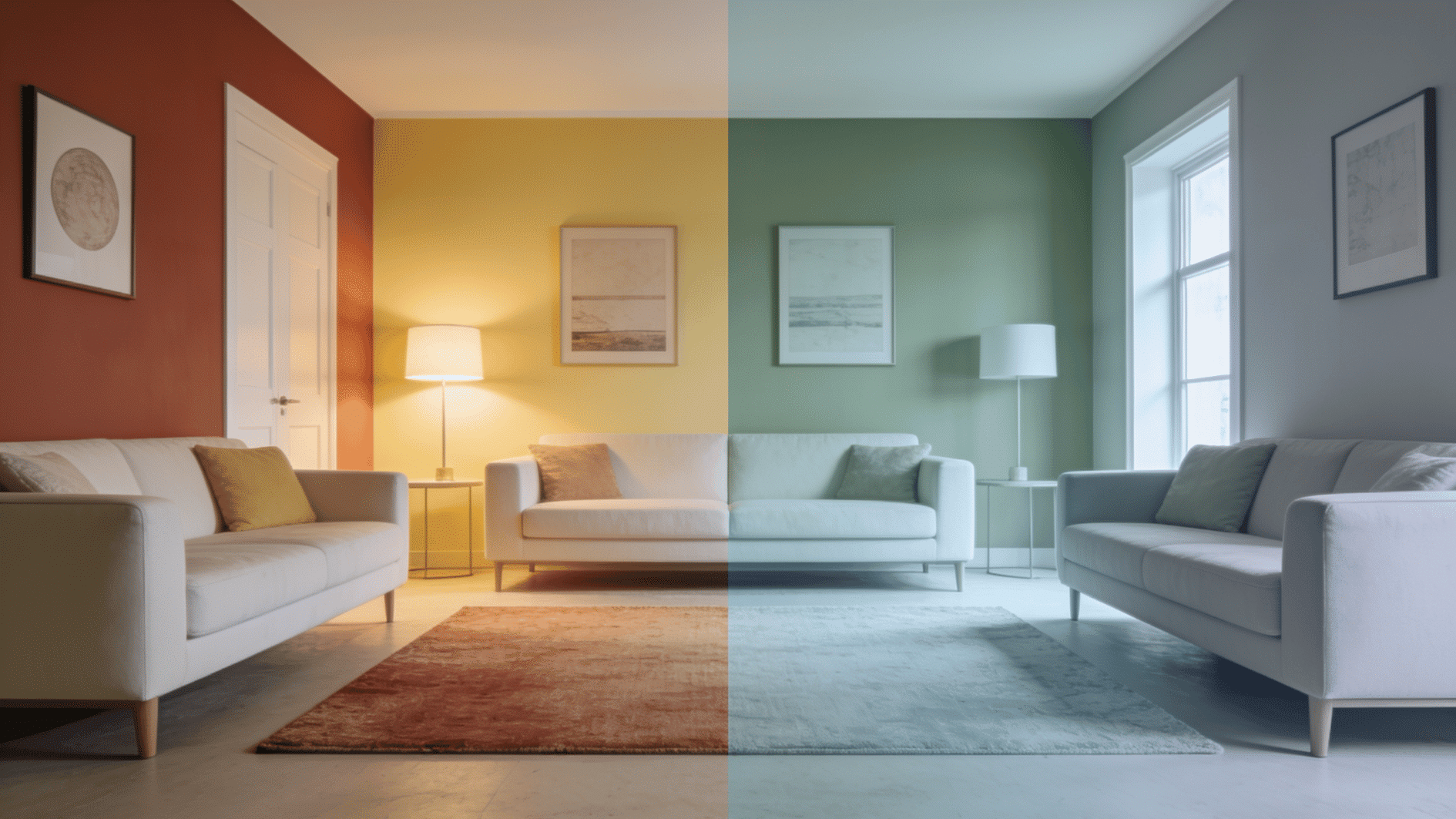
Every paint color falls somewhere on a temperature scale, and knowing which side you’re leaning toward makes the whole decision easier.
Warm and cool tones don’t just affect how a color looks, but how a room feels the moment you walk in.
| Factor | Cool Colors | Warm Colors |
|---|---|---|
| Colors | Blues, greens, grays, icy whites | Reds, oranges, yellows, terracotta, beige |
| Mood / Feel | Calm, relaxing, airy, peaceful | Energetic, cozy, inviting, warm |
| Space Effect | Makes rooms feel larger and more open | Makes rooms feel smaller and more intimate |
| Best Rooms | Bedrooms, bathrooms, home offices | Living rooms, dining rooms, social spaces |
| Design Impact | Creates a clean, minimal, soothing look | Adds warmth, comfort, and visual richness |
Which Color Works Best for Each Room?
The right color often depends on the room’s purpose, so here’s a quick guide to what tends to work best in each space.
- Living Room: Warm neutrals or soft terracotta tones keep the space feeling welcoming for gatherings.
- Bedroom: Cool blues, sage greens, or muted grays support a calmer, more restful mood.
- Kitchen: Warm tones like buttery yellow or warm white add energy for a space that sees constant activity.
- Bathroom: Cool colors such as soft blue or seafoam green echo a clean, spa-like feel.
- Home Office: Cool, muted tones like slate blue or soft gray help with focus and reduce visual distraction.
- Dining Room: Warm shades like deep red or amber can make meals feel more social and inviting.
- Hallways and Entryways: Warm neutrals help smaller, light-starved spaces feel cozy rather than cold.
How to Decide Between the Two?
Think about the mood you want and the amount of natural light the room already gets.
A room with plenty of warm afternoon sun can handle a cool color beautifully, while a dim, north-facing room might feel flat with anything too cold.
There’s no strict rule – it’s about matching the temperature of the color to the temperature of the light and the feeling you’re going for.
How to Choose a Paint Color?
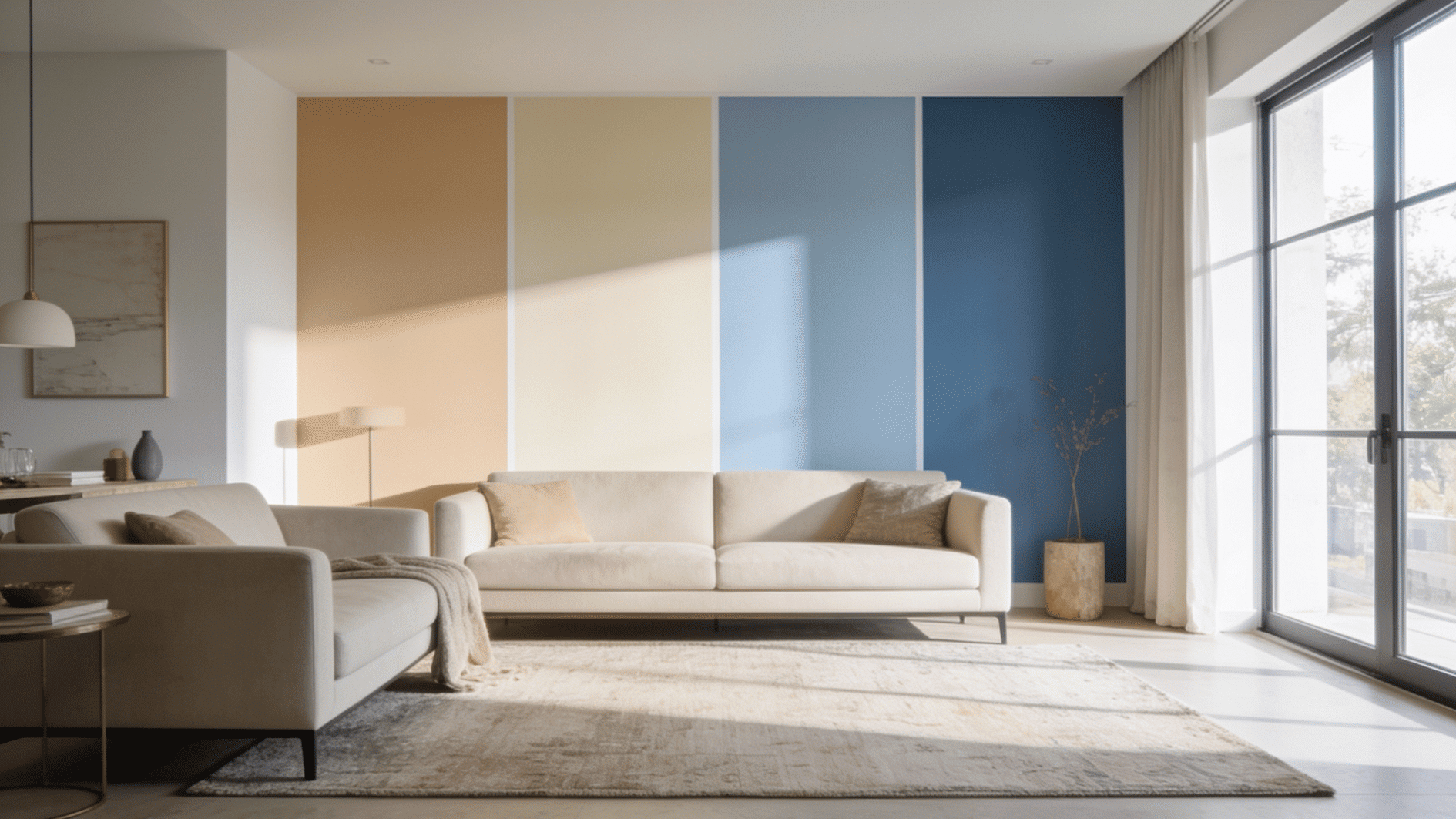
Once you understand why color choice matters, the next step is knowing what actually influences how a color looks in your space. Here’s what to check before you pick up a paintbrush.
1. Understand Your Room’s Lighting
A color that looks warm and inviting under the morning sun can turn flat and gray by evening, which is why testing on the wall matters so much.
- North-facing rooms tend to pull cooler and dimmer light, making colors look more muted
- South-facing rooms get warmer, brighter light, which can make the same color look punchier than expected
- Tape a sample to the wall and watch it through the day: morning, afternoon, and evening
- Check it under lamps too, since artificial light changes how a color reads
2. Learn About Undertones
Every color hides a secondary tone that only reveals itself once it’s on your wall. Undertones are the subtle background hue hiding inside a color – the hint of blue in a “white,” the touch of pink in a “beige.”
They’re sneaky because they don’t show up clearly until the paint is on a large surface, next to your furniture or flooring, where it has room to reveal itself.
If the color suddenly looks more yellow, pink, or blue than you expected once it’s up, that’s your undertone introducing itself.
Note: The easiest way to catch a difficult undertone is to compare your swatch against a plain white sheet of paper in natural light.
3. Match the Color to Your Room’s Purpose and Decor
Your paint color has to live alongside your flooring, furniture, and fixed elements you’re not changing anytime soon.
- Start with the piece you love most and let it guide your undertone and depth of color
- Build the room around one strong piece, like a rug or chair, letting the walls support it rather than compete with it
- Match the tone to the room’s purpose: calmer, softer shades for bedrooms, richer, warmer tones for kitchens and living rooms
- Ask what you want to feel in the room, and let that guide your choice, not just the current trend
4. Test Before You Commit
No color should go on your walls for good until you’ve lived with it for a few days first. This is the step people skip, and it’s the one that causes the most regret.
Paint a patch at least a couple of feet wide, not a tiny square, since small samples can be misleading at full scale. Live with it for a few days, checking it in different lights, before making it official.
If you still love it by day three, you’ve probably found your color.
Popular Paint Colors Worth Considering
If you’re still narrowing things down, a few shades come up again and again for good reason – they’re versatile, they age well, and they work across different lighting and decor styles.
- Warm White or Off-White: A soft, adaptable base that keeps rooms feeling bright without going stark or cold. Hex Code- FDF4DC, #FAF9F6
- Greige: A blend of gray and beige that pairs easily with almost any decor style, though it’s worth testing carefully since it can shift warm or cool depending on light. Hex Code: #B0A999
- Sage Green: A calming, earthy tone that works beautifully in living rooms and bedrooms alike. Hex Code: #9CAF88
- Soft Navy: A deep, grounding color that adds drama without feeling heavy, especially in dining rooms or accent walls. Hex Code: #3D3D90
- Terracotta: Warm, inviting tones that bring a lived-in coziness to living spaces and entryways. Hex Code: #E35336
Note: These aren’t the only options worth considering, but they’re a solid starting point if you want colors that tend to work more often than not. Color Codes Chart
Common Mistakes to Avoid
Even with the right factors in mind, it’s easy to fall into a few common traps that lead to disappointing results. Knowing what to watch out for can save you time, money, and an unwanted repaint.
Here are the mistakes worth avoiding.
- Ignoring Undertones. A color that looks neutral on the card can reveal a surprising lavender, green, or yellow cast once it’s mixed with your room’s lighting and surrounding colors. Skipping this check is one of the most common reasons a “safe” color ends up feeling off.
- Choosing Colors in the Store Only. Store lighting is designed to make everything look good – which means it’s misleading. A color that looks perfect under fluorescent showroom lights can shift dramatically once it’s home under your own windows and lamps. Always test in the actual space.
- Overlooking Sheen and Finish. The finish you choose – matte, eggshell, satin, or gloss – changes how a color appears. An eggshell finish is often a practical middle ground because it gives walls a soft look while offering more durability than flat paint.
Final Thoughts
Choosing the right paint color really comes down to these few things. Skip the guesswork, and you skip the regret that comes with it.
If you started this article wondering how to choose a paint color that will actually work once it’s on your walls, you now have a clear, practical way to get there, rather than hoping for the best.
Start small by picking up a few sample pots of your top choices and test them on your actual walls this week before you make it official. Your future self, standing in a room that finally feels right, will thank you.
Frequently Asked Questions
How Many Paint Samples Should I Test Before Deciding?
Test 2–3 finalists at most, so you can compare real options instead of feeling overwhelmed.
Should Ceilings Be Painted the Same Color as the Walls?
Not necessarily – a lighter ceiling shade usually keeps a room feeling open and airy.
How Long Should I Wait Before Repainting if I Don’t Like the Color?
Give it at least a full week, since first impressions often change once you adjust to a new color.
Can I Use the Same Paint Color Throughout My Whole House?
You can, but varying the shade slightly from room to room often feels more intentional than a single flat color everywhere.