


Most people learn what the primary colors are back in kindergarten. Red, blue, yellow, simple, right?
Professional artists and designers often work with a completely different set of primary colors, and that gap in knowledge? It silently holds back much creative work.
Knowing what the primary colors actually are, whether in painting, digital design, or print, can make a real difference in how color mixing and visual results turn out.
This blog breaks down primary colors across different color models, explains why they vary, and shows how that knowledge applies to real creative work. Keep reading, it’s more practical than it sounds.
What are the Primary Colors?
Primary colors are the fundamental hues that cannot be created by mixing other colors together. These basic colors serve as the building blocks for all other colors in the color spectrum.
They form the foundation of color mixing and are essential across fields such as art and design. The primary colors vary depending on the medium used. Usually, the primary colors are red, yellow, and blue (RYB).
These colors are combined to create secondary colors such as green, orange, and purple.
Understanding primary colors helps artists and designers create a wide range of colors and effects, making them a crucial element in any creative process.
The Historical Evolution of Primary Color Theory
The concept of primary colors has changed over time. In the 1600s, Isaac Newton proposed that colors result from light and its interaction with different materials, laying the foundation for modern color theory.
His work led to the understanding that colors are formed through light and can be broken down into distinct wavelengths.
Later, Johann Wolfgang von Goethe took a psychological approach to color, exploring how colors influence human emotions and perception.
His theories shifted the focus from physical properties to psychological effects.
This research eventually led to the development of the RYB (Red, Yellow, Blue) color model, which became the standard for artists and remains influential in creative fields today.
The Traditional Approach to Primary Colors
This is the system most artists use when they first pick up a brush and a palette. It focuses on physical matter, such as paint or charcoal, and has been the standard in creative education for centuries.
While this model is great for beginners, it isn’t ideal for high-end color mixing because it sometimes yields muddy browns instead of bright purples.
Still, it remains the foundation for many painters who appreciate the organic feel of these classic tones.
The RYB Breakdown:
- Red: A warm, bold base used for oranges and purples.
- Yellow: The brightest primary, essential for greens and oranges.
- Blue: The cool foundation for greens and deep violets.
The Science Behind Modern Pigments
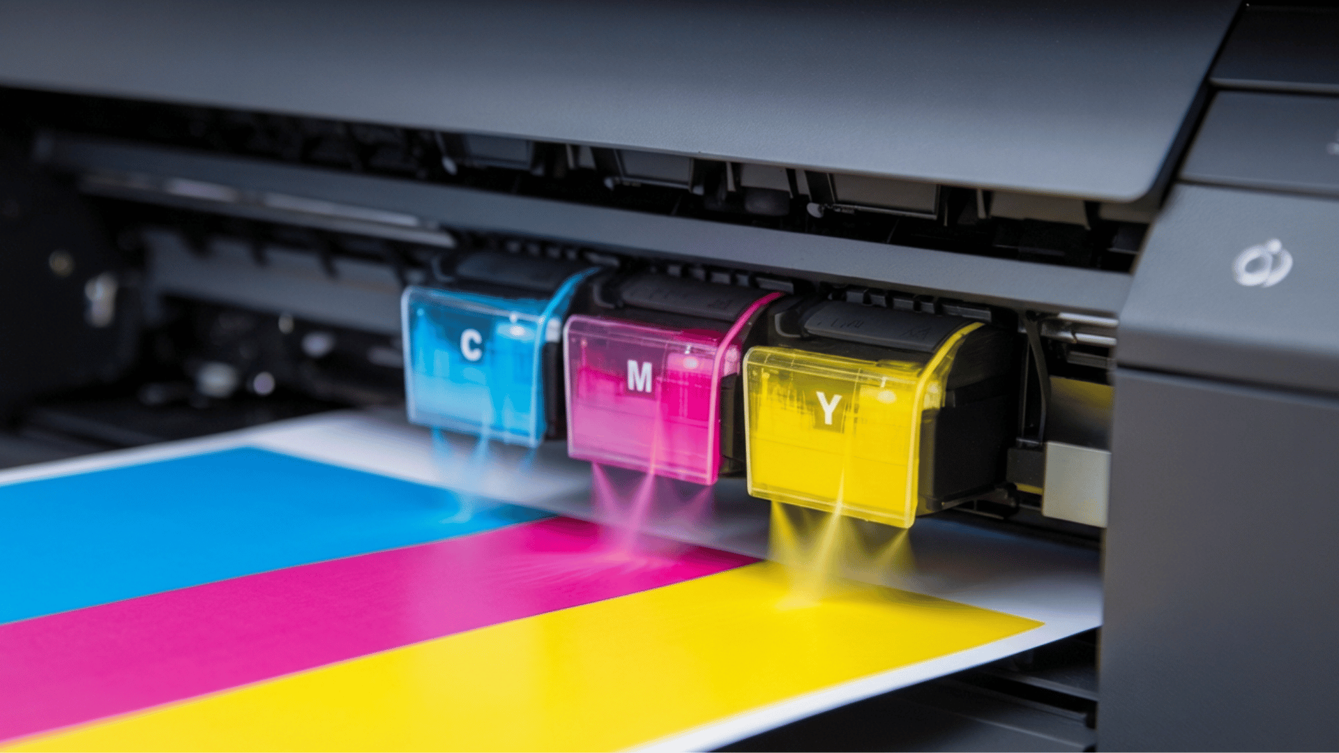
If you’ve ever replaced the ink in your home printer, you might have noticed the colors weren’t red and blue, but bright pink and teal-like cartridges.
These colors: cyan, magenta, and yellow represent a more accurate system for mixing physical colors, known as the “subtractive” method.
This system is used by professionals to produce crisp, vibrant images for print media such as books and posters.
By using cyan (a greenish-blue), magenta (a purplish-red), and yellow (a clean, sunny pigment), designers can create a broader spectrum of shades.
These colors mix to form everything from deep blues and rich violets to vibrant oranges and greens, ensuring clarity and detail in the final image.
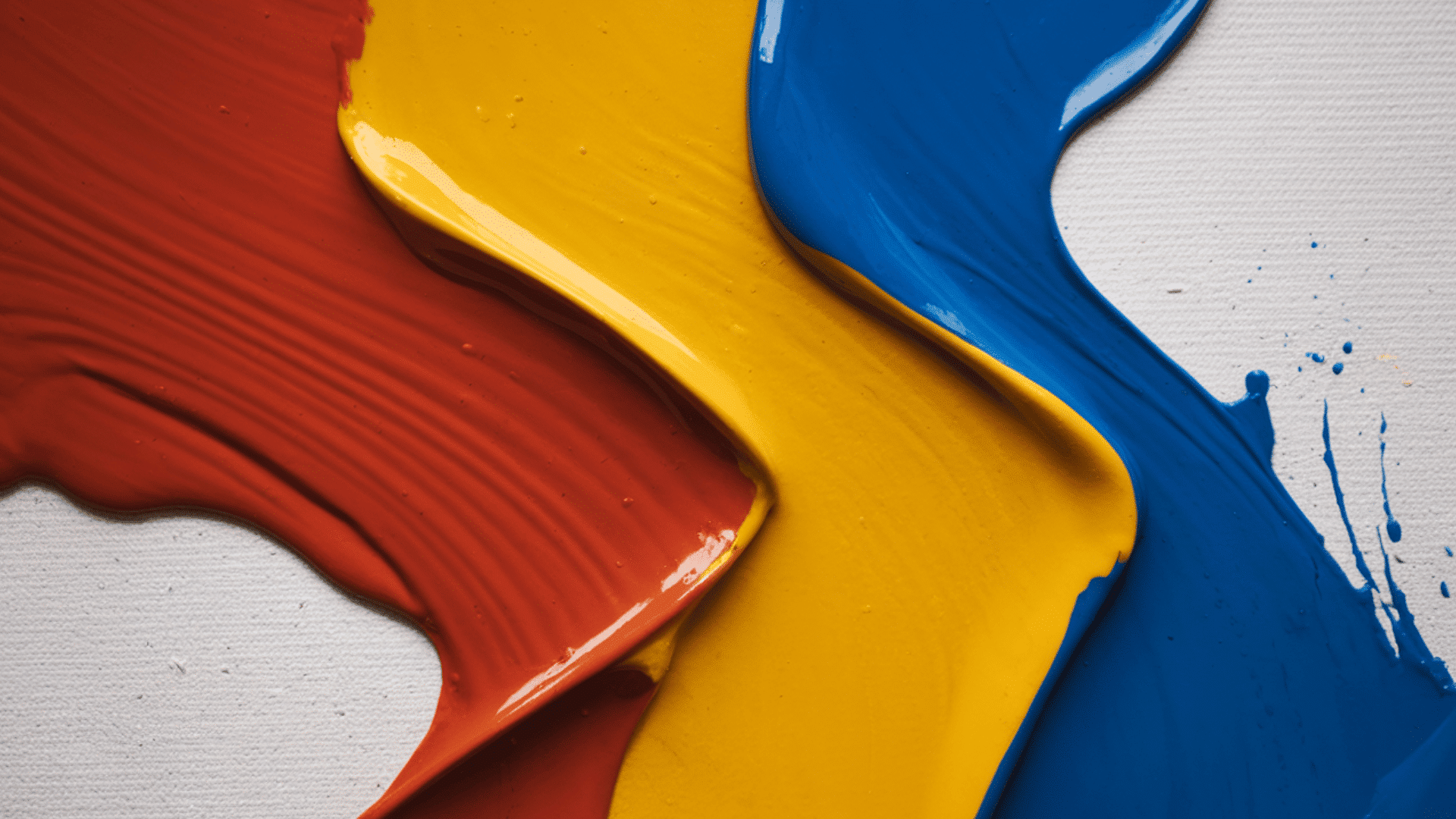
The Primary Colors of Light
![]()
Everything you see on your phone, laptop, or TV is made up of light, not ink. Unlike paint, light follows a “multiplicative” or additive process, meaning that colors are combined to create white light.
In this system, green replaces yellow as the primary color. While it may seem odd that mixing red and green light creates yellow, that’s exactly how your screen displays this blog post.
Why RGB is Important:
- Digital Displays: Each pixel on your screen is made up of tiny clusters of Red, Green, and Blue light.
- Creating White: When all three colors are at full intensity, they create pure white light.
- Photography: Cameras use these three light-sensitive channels to capture the world around us.
Difference Between Additive and Subtractive Color Models
Here’s a simple comparison table to show the key differences between additive and subtractive color models:
| Aspect | Additive (RGB) | Subtractive (CMYK) |
|---|---|---|
| Primary Colors | Red, Green, Blue (RGB) | Cyan, Magenta, Yellow, Black (CMYK) |
| Color Mixing Process | Colors are created by combining light. | Colors are created by subtracting light with pigments. |
| Result of Combining Colors | Combining all colors produces white light. | Combining all colors produces black (or a dark, muddy color). |
| Applications | Digital screens, photography, stage lighting, and TVs. | Printing, painting, and other color applications with pigments. |
| Basic Concept | More light = more color. | More pigment = less light. |
| Color Creation | Uses light emission to form colors. | Uses light absorption to form colors. |
| Final Color | Starts with black (absence of light). | Starts with white (absence of pigment). |
Which System Should You Use?
Choosing the right set of primaries depends on your project goals. If you are sitting down to paint a portrait on canvas, the traditional red, yellow, and blue approach will serve you well for blending natural skin tones and landscapes.
However, if you are designing a logo for a website or preparing a file for a local print shop, you must switch to RGB or CMYK.
Using the wrong system can make your colors look dull or completely different once they move from the screen to the paper.
The Power of Primary Colors in Diverse Fields
The gap between what artists call primary colors and what scientists define as primary is wider than most people realize.
Both groups are right in their own way, but they’re working from completely different frameworks and goals.
- Artists use ryb for traditional painting: it’s intuitive for mixing physical pigments and serves as the foundation for color wheels used in art education.
- Scientists and engineers use RGB and CMYK: RGB (red, green, blue) is for digital displays, while CMYK (cyan, magenta, yellow, black) is for printing, each based on how light or ink interacts with the medium.
- Psychologists focus on perception: some researchers argue that red, green, blue, and yellow are the psychological primaries because they represent pure colors without traces of other colors.
- Physicists define color in terms of wavelengths: from a physics standpoint, color is electromagnetic radiation at different frequencies, with the concept of primary colors a human construct.
- Designers blend RGB and CMYK models: graphic designers switch between RGB for screens and CMYK for print, depending on the medium they’re working with.
Conclusion
Now that you know what the primary colors are, you can see how these basic hues form the foundation of everything from your artwork to digital designs.
These colors are the building blocks that make the vibrant world around us possible. Next time you mix paints or create on your screen, remember the power these primary colors hold in your hands.
Ready to take your creativity to the next level? Explore more about primary colors and how they can bring your projects to life