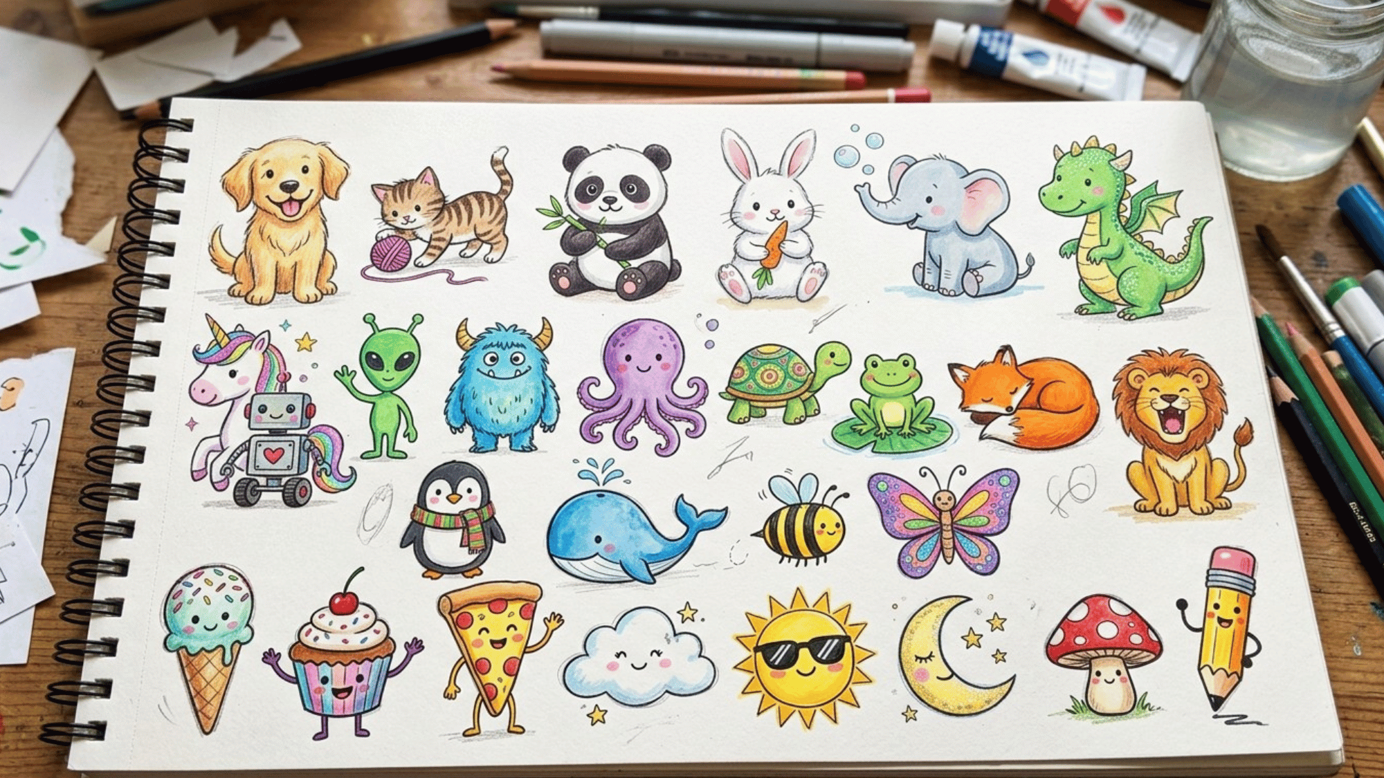


Ever looked at a drawing and thought, “How does that look so real?”
The secret usually comes down to one thing: the elements of art value. It sounds technical, but it’s actually pretty straightforward once it clicks.
Artists have been using it for centuries, and it shows up in every single artwork you’ve ever admired. Once you understand it, you start seeing it everywhere.
Stick around to learn more about it.
What is Value in Art?
Value in art refers to how light or dark a color, shape, or object appears. It is one of the seven elements of art and helps artists create realistic and eye-catching images.
For example, think about a white cloud against a dark gray storm sky. Even though both are in the same scene, their different values make each stand out.
Artists use these light and dark areas to show where light is shining and where shadows fall. By changing value, they can make flat drawings look more three-dimensional and easier for viewers to understand.
How Do Artists Use Light and Dark While Making Something?
Light and dark are the two ends of the value scale. Learning value in art means learning to control everything in between. Once you understand this range, you start seeing it in every artwork you look at.
Here are the key ways artists work with light and dark values:
- Tints: Mixing white into a color raises its value, making it lighter and softer in tone.
- Shades: Mixing black into a color lowers its value, pushing it toward deep, rich darkness.
- Light Source: Where highlights and shadows fall tells the viewer exactly where light is hitting the subject.
- High Contrast: Placing very light and very dark values side by side instantly grabs the viewer’s attention.
- Gradation: A smooth, gradual shift from light to dark makes curved or rounded surfaces look realistic.
- Chiaroscuro: This technique uses extreme light and shadow together to add dramatic depth and emotional weight, with many excellent examples at the Metropolitan Museum of Art.
- Flat Values: Keeping values uniform and unvaried creates a strong, graphic look with no illusion of depth.
Functions of Elements of Art Value in Visual Art
Value is the hidden structure beneath every great artwork. The elements of art’s value principle show that even color loses its power without a strong tonal foundation.
Every decision an artist makes about light and dark shapes how the viewer experiences the piece. Here is how value does the heavy lifting in any composition:
- Creates Form: Light hitting one side and shadow on the other makes a flat shape read as a 3D object.
- Builds Depth: Lighter values naturally appear farther away while darker values feel closer to the viewer.
- Sets Mood: Low-key dark compositions feel tense or somber, while high-key light ones feel calm and open.
- Adds Unity: A consistent value structure makes all parts of a composition feel like they belong together.
- Guides the Eye: Artists place their lightest and darkest values at the focal point to control where viewers look first.
- Improves Readability: Strong value contrast keeps the artwork clear and easy to read even from a distance.
- Supports Color: Value gives every color its visual weight, making it feel bright, bold, muted, or dramatic.
What is the Difference Between Value and Color in Art?
Color and value are two separate elements of art that work together but mean very different things. Many beginners confuse the two, which makes understanding light, shadow, and contrast much harder than it needs to be.
| Aspect | Color | Value |
|---|---|---|
| Definition | The hue itself (red, blue, yellow) | How light or dark a color appears |
| Depends On | Pigment or wavelength of light | Amount of light or shadow present |
| Exists Without the Other? | No, every color has a value | Yes, value exists even in black and white |
| Role in Art | Creates mood, identity, and harmony | Creates form, depth, and contrast |
| Affected By | Mixing with other hues | Adding white (tint) or black (shade) |
| Visible In | Color paintings and illustrations | Sketches, charcoal, grayscale, and color work |
| Common Mistake | Choosing colors without considering their value | Ignoring how dark or light a color reads tonally |
| Used To | Differentiate objects and set the temperature | Make flat shapes look three-dimensional |
| Measured By | Color wheel position | Value scale from white to black |
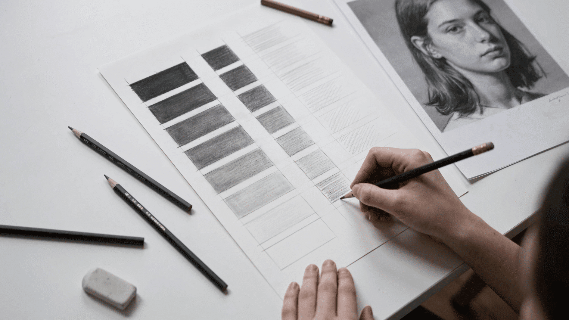
Common Techniques for Creating Value in Art
Knowing the theory is half the job. The other half is the physical act of applying tones with control. Every medium has its own toolkit of elements of art :
1. Hatching and Cross-Hatching
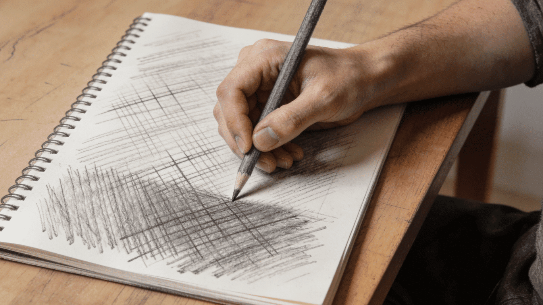
Parallel lines drawn close together create the illusion of tone through density; the tighter the lines, the darker the value. Crossing a second set of lines over the first deepens the shadow further.
This technique gives the artist precise, deliberate control. Artists like Dürer and Rembrandt used cross-hatching to build extraordinary depth with nothing but a single ink line.
2. Blending and Stumping

Tone is built by physically smoothing the medium across the surface, using a finger, a blending stump, a chamois, or a soft brush.
This technique is essential for realistic portraiture, sculptural charcoal work, and any subject where smooth surface quality matters.
The trade-off is thatoverblending can flatten form, so it works best in combination with deliberate mark-making.
3. Layering and Tonal Glazing
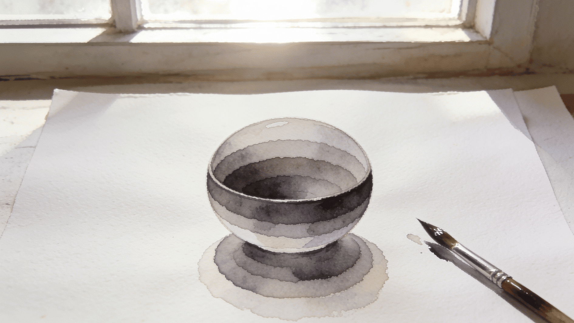
Rather than mixing tone in a single pass, this technique builds value gradually through multiple transparent or semi-transparent layers.
Each layer deepens the tone slightly, allowing for fine-tuned control. It is the dominant approach in colored pencil, watercolor, and traditional oil painting.
The patience required pays off in richness – layered values have a luminosity that single-pass rendering rarely achieves.
4. Subtractive Drawing
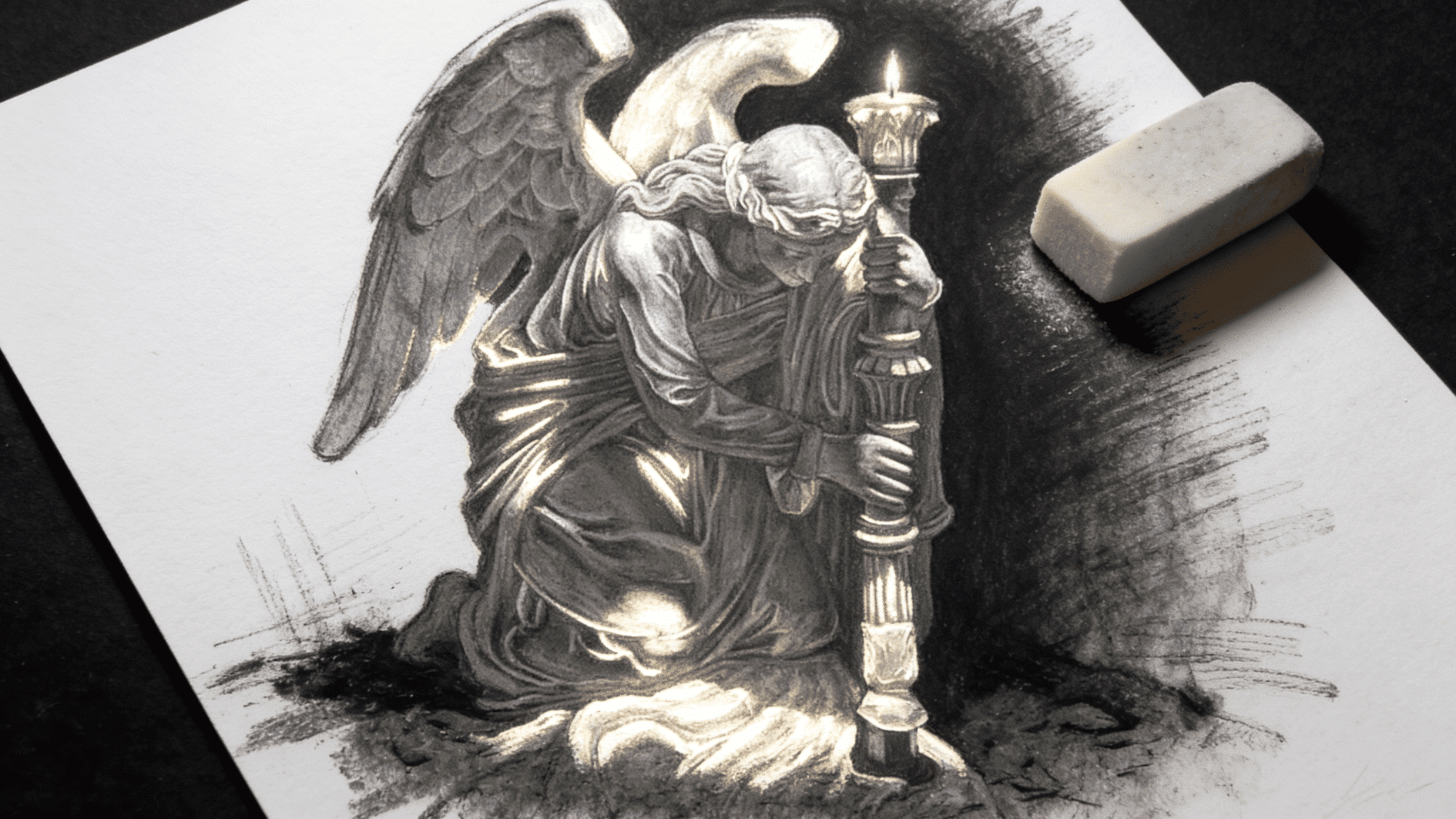
Instead of adding dark marks to a light surface, subtractive drawing starts with a darkened ground and uses an eraser to pull light back out.
This reverses the usual spatial logic and trains a fundamentally different way of seeing – you’re carving light rather than applying shadow.
It is particularly effective with charcoal and graphite on toned paper, and produces a dramatic, high-contrast quality that feels immediately painterly.
5. Flat Value Blocking
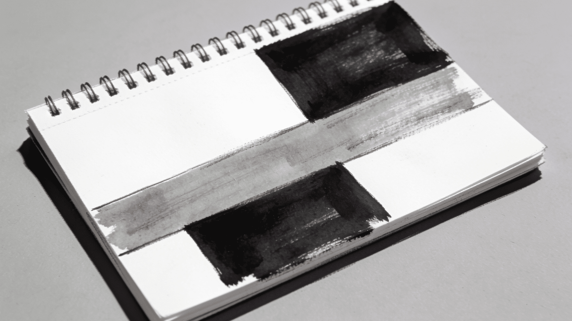
The scene is simplified into two to four distinct flat tonal shapes, with no blending or gradation between them.
This is less a rendering technique and more a planning and design tool; widely used by concept artists, illustrators, and animators to solve compositional problems fast.
A strong flat value block-in immediately reveals if the light-and-dark structure of a composition is readable before any detail work begins.
Resources You Can Refer to Learn About the Elements of Art Value
Teaching value as an element of art becomes much easier when you have the right resources in hand.
If you are lesson planning, building a presentation, or looking for printable materials, good classroom tools help this concept stick with students.
Here are the best types of resources to use when teaching value in art:
| Resource Type | What It Covers | Best Used For |
|---|---|---|
| Step-by-Step Lessons | Value scale, gradation, tints, and shades | Introducing the concept to beginners |
| Printable PDFs | Worksheets for shading, labeling, and practice | Independent or at-home practice |
| Slide Presentations | Definitions, artwork examples, and visual explanations | Whole-class instruction and discussion |
| Value Scale Exercises | Building 5 or 9-step scales from white to black | Developing foundational tonal awareness |
| Famous Artwork Analysis | Spotting value in chiaroscuro and charcoal works | Connecting elements of art value to art history |
| Sketchbook Prompts | Shading spheres, cubes, and simple objects | Low-pressure individual practice |
| Assessment Rubrics | Grading contrast, gradation, and value application | Evaluating student artwork fairly |
| Video Demonstrations | Real-time shading and technique walkthroughs |
Supporting visual learners in any grade |
Wrapping it Up
You made it, and now you know the secret behind every great drawing! Value is simply how light or dark something looks, but don’t let that fool you. It’s actually one of the most powerful tools any artist can use.
Once you start noticing it, you’ll spot it everywhere, in comics, paintings, and even your favorite cartoon.
So pick up your pencil and try it yourself. Practice your value scale, experiment with shading, and see how flat shapes suddenly start looking three-dimensional.
It might feel tricky at first, but keep going. Your art is about to level up big time!
Frequently Asked Questions
Can Digital Artists Value the Same Way Traditional Artists Do?
Yes, same principles, just applied with digital brushes and opacity settings instead of physical tools.
How Many Values Should a Beginner Start With?
Start with a 5-step scale from white to black before advancing to a 9-step scale.
Which Medium Is Best for Learning Value as A Beginner?
Graphite pencil, it works in grayscale, so you focus purely on light and dark without color as a distraction.