




Every last Monday of May, the United States pauses to honor the men and women who gave their lives in military service.
Color plays a quiet but powerful role in how people mark the day, from front porches to creative projects.
Memorial Day colors show up in more places than most people realize. Each shade carries its own history, its own weight, and its own meaning rooted in sacrifice and remembrance.
Understanding what stands behind these colors adds a layer of intention to the way they are used, seen, and appreciated.
Official Memorial Day Colors
Red, white, and navy blue are the official Memorial Day colors, recognized across the United States every year on the last Monday of May.
These three shades are directly inspired by the American flag, making them the most widely used and accepted colors for the holiday.
Black is also acknowledged in some observances, and purple holds a place in military recognition.
While the core three remain the standard, the full palette extends slightly depending on the context, whether personal, ceremonial, or creative.
The Meaning Behind Memorial Day Colors
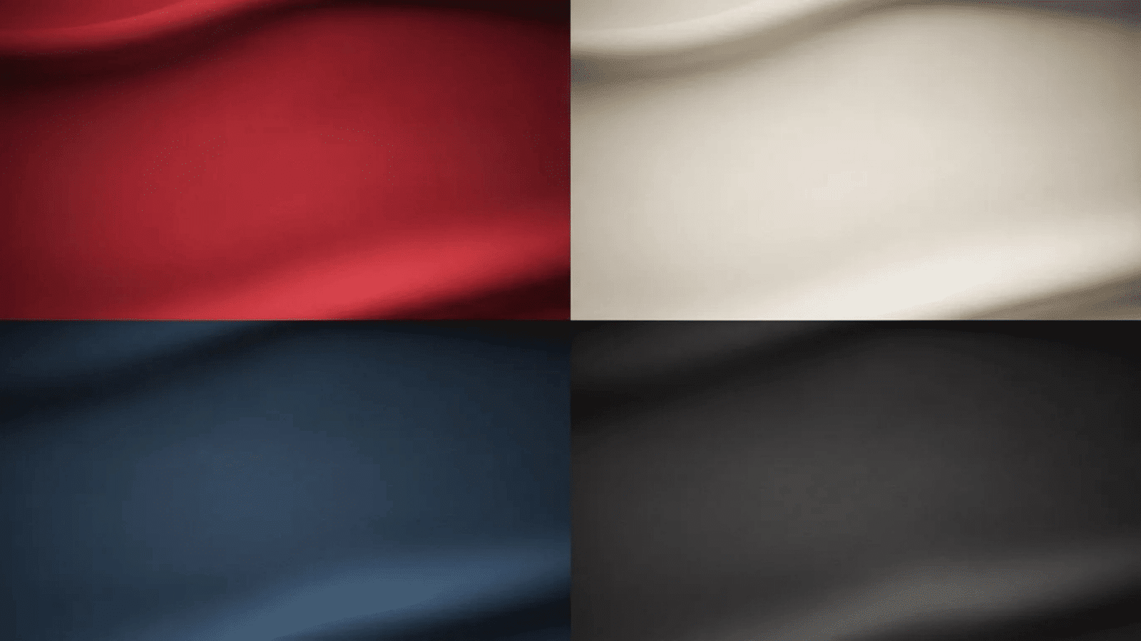
Each of the Memorial Day colors used in displays and decor carries a specific historical meaning. Understanding what they stand for adds intention to every design choice.
1. Red: Valor and Sacrifice
Red is the most emotionally charged of all the Memorial Day colors and carries the heaviest symbolic weight of the three.
Red symbolizes bravery, courage, and sacrifice, representing the bloodshed of fallen soldiers and the battles they fought for freedom.
It is also tied to the red poppy, a flower worn across the world as an act of remembrance for the fallen.
2. White: Purity and Honor
White brings balance to the Memorial Day color palette and carries a quiet dignity that complements the stronger tones around it.
White represents purity and innocence, standing for the selfless sacrifices made by those who fought for the freedom we cherish, a color of dignity and peace.
It is also a symbol of the moral clarity that drives service, the belief that some things are worth protecting regardless of personal cost.
3. Navy Blue: Justice and Vigilance
Navy blue is the most grounding of the Memorial Day colors and gives any display a sense of weight and permanence that the other colors alone cannot achieve.
Navy blue represents vigilance, perseverance, and justice qualities that service members sacrificed their lives to uphold and protect across generations of conflict.
It speaks to the steady, unwavering commitment that defines military service at its most fundamental level.
4. Black: Mourning and Solemnity
Black appears less frequently in Memorial Day color palettes but carries a distinct meaning when it does, and should be handled with care.
Black is incorporated for a more somber tone, worn or displayed as a sign of mourning for those who have sacrificed their lives in service to the country.
It represents the grief that lies beneath the surface of every Memorial Day gathering, even when it is not spoken aloud.
Memorial Day Color Palettes for Every Design Style
Choosing the right color palette sets the tone for the entire design before a single element is placed on the page.
1. Classic Patriotic Palette

Bold, clean, and instantly recognizable, this palette stays as close to the flag as it gets.
It draws directly from the three core colors of the American flag, making it the most straightforward and widely accepted choice for Memorial Day design work.
This palette, which needs no explanation and communicates patriotism at first glance, is the one to reach for.
- Best For: Flyers, social media graphics, event banners
- Pairs Well With: Bold serif fonts and star or stripe graphic elements
2. Soft Vintage Palette
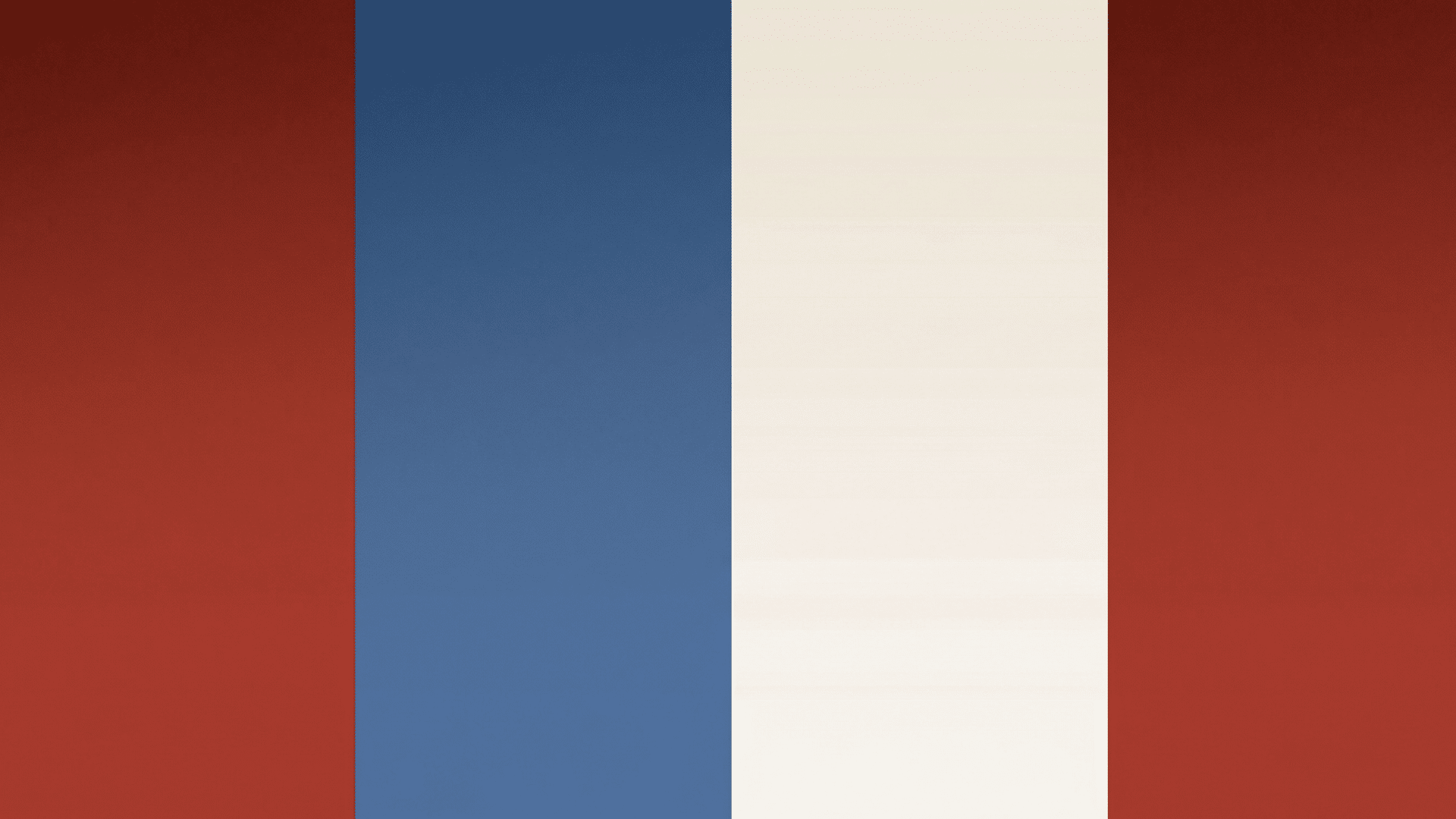
A quieter, more nostalgic take on the traditional Memorial Day colors, warm, faded, and full of character.
The tones here are pulled back from their full intensity, giving the palette a lived-in quality that feels personal rather than commercial. The essentials that will help you get the most out of this palette.
- Best For: Scrapbooking, greeting cards, vintage-style print designs
- Pairs Well With: Handwritten or script fonts and distressed texture backgrounds
3. Rustic Americana Palette
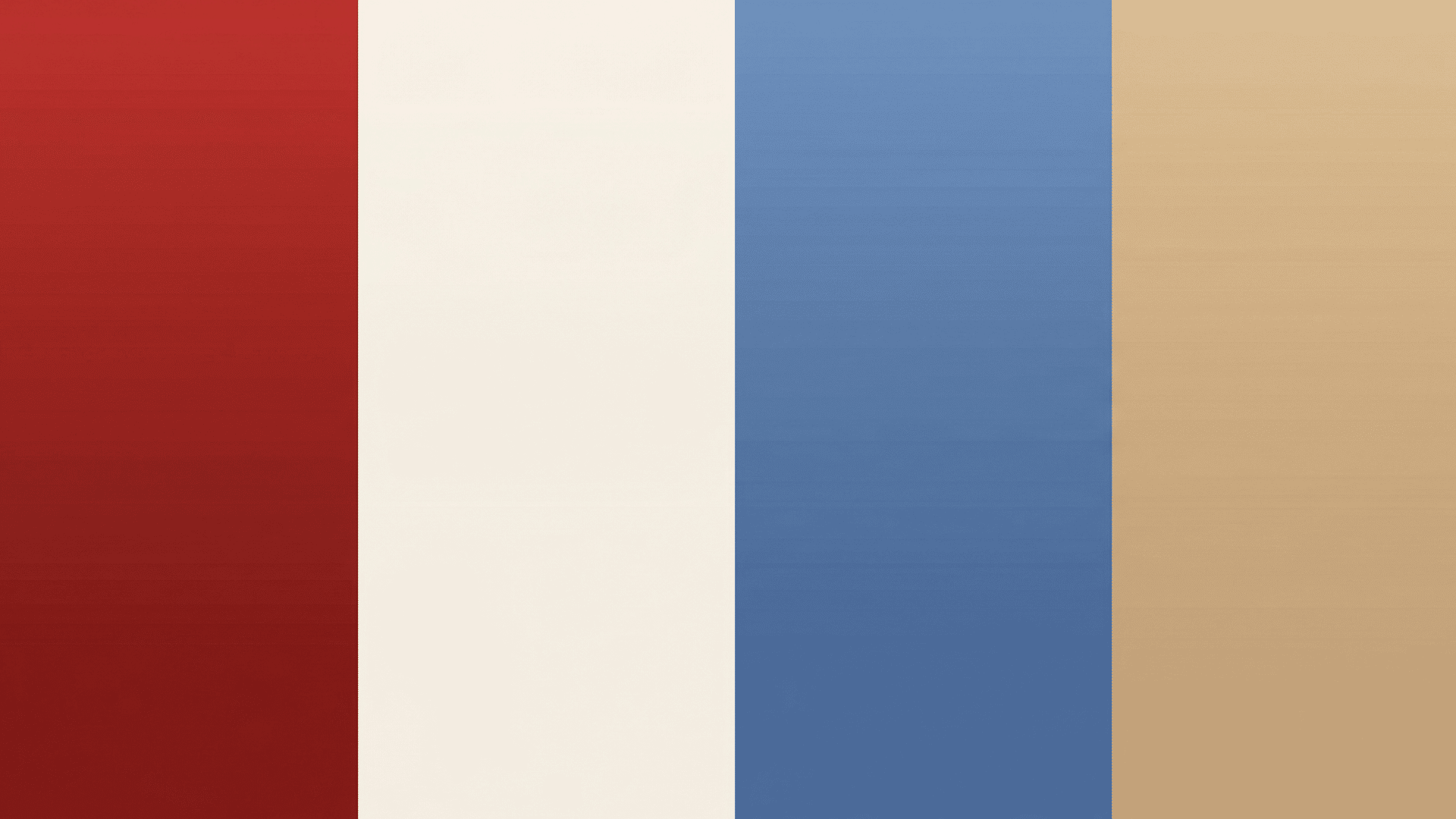
Earthy, grounded, and personal, this palette brings a warm, handcrafted feel to any creative project.
The combination of barn red, cream, denim blue, and tan pulls away from the polished and leans into the natural and textured.
It is the kind of palette that feels right at home on a wooden surface, a linen tablecloth, or a hand-stamped card.
- Best For: DIY crafts, home decor, Etsy shop designs
- Pairs Well With: Woodgrain or burlap textures and slab serif typography
4. Refined Memorial Palette

Formal, refined, and solemn, built for projects that call for dignity and composure. Deep navy and silver bring a ceremonial weight to the layout, while ivory softens the overall tone.
The touch of poppy red adds quiet emotional resonance without detracting from the solemnity of the occasion. The essentials that will help you get the most out of this palette.
- Best For: Formal invitations, memorial programs, print design
- Pairs Well With: Thin, refined serif fonts and minimal layout spacing
5. Bold Summer Palette

High energy and celebration-ready, the palette that stands out in any feed or outdoor display. Bright red and royal blue bring full intensity, while crisp white keeps the layout balanced.
Sunshine yellow is the unexpected addition that gives this palette its edge, making it the strongest choice when visibility and impact are the priority.
The essentials that will help you get the most out of this palette.
- Best For: Social media posts, outdoor event signage, festive packaging
- Pairs Well With: Bold sans-serif fonts and high-contrast graphic layouts
Color Codes at a Glance
These colors and their hex codes make it easy to match shades in your designs, and the table below shows you quick combinations you can use right away.
| Palette Name | Color 1 | Color 2 | Color 3 | Color 4 |
|---|---|---|---|---|
| Classic Patriotic | B22234 | F5F5F5 | 002868 | 8B0000 |
| Soft Vintage | A63228 | 4A6FA5 | F8F4EF | D6CFC7 |
| Rustic Americana | 8B1A1A | F5F0E8 | 4B6FA5 | C4A882 |
| Refined Memorial | 002147 | C0C0C0 | FFFFF0 | E8352B |
| Bold Summer | CC0000 | 002FA7 | FFF8DC | FFD700 |
Ways to Use Memorial Day Colors Across Creative Projects
Memorial Day colors carry meaning beyond displays and decor. Here is how to apply them with intention across a range of creative formats.
- Packaging Design: Lead with navy or white as the base packaging color and bring red in through typography or border details to keep the product looking intentional.
- Event Flyers: Lead with navy as the dominant background and reserve red for key details like dates and titles so the most important information stands out immediately.
- Home Decor: Layer the colors through textiles first, tablecloths, runners, and napkins, before adding decorative objects or floral arrangements on top.
- DIY Projects: Keep handmade crafts and decorations within the red, white, and navy palette so every finished piece reads as part of one cohesive creative direction.
Final Thoughts
Color is rarely just decoration, and on Memorial Day, it is never just decoration. Every shade placed on a porch, a table, or a design carries something older than the current year.
The people behind these colors gave more than most of us will ever be asked to give.
Using Memorial Day colors with that awareness in mind changes how they look and what they communicate to everyone who sees them.
Pick up the palette with purpose this year in your home, your designs, or wherever the day takes you, and let the colors do what they were always meant to do.