

Color theory is a fundamental concept in art that guides how colors interact to create visually pleasing and meaningful compositions.
Understanding color theory allows artists to use color intentionally, evoking specific emotions and messages through their work.
From primary colors to complex color relationships, this theory offers valuable tools for artists of all skill levels.
By mastering the principles of color harmony, contrast, and symbolism, artists can communicate more effectively and bring depth to their creations.
In this blog, you will gain insights into essential color theory concepts and learn how to apply them to your art.
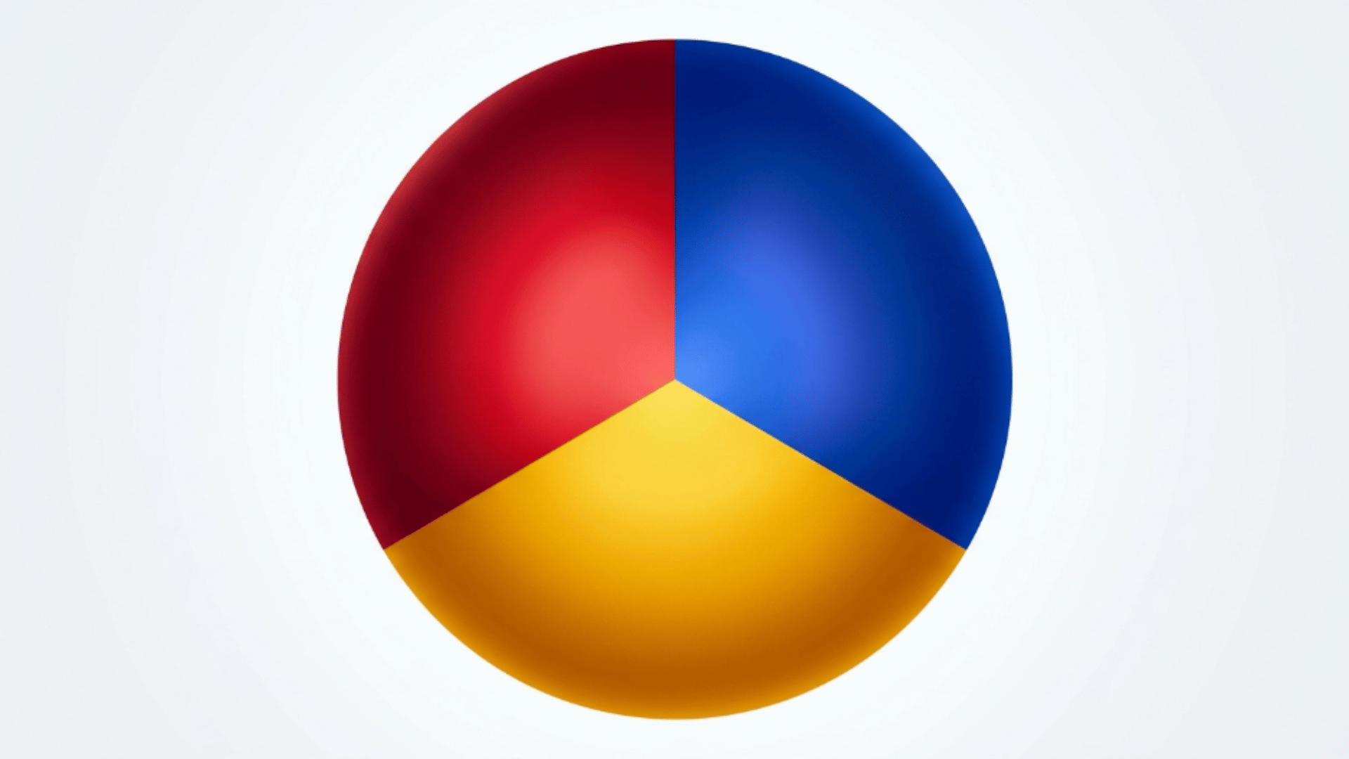
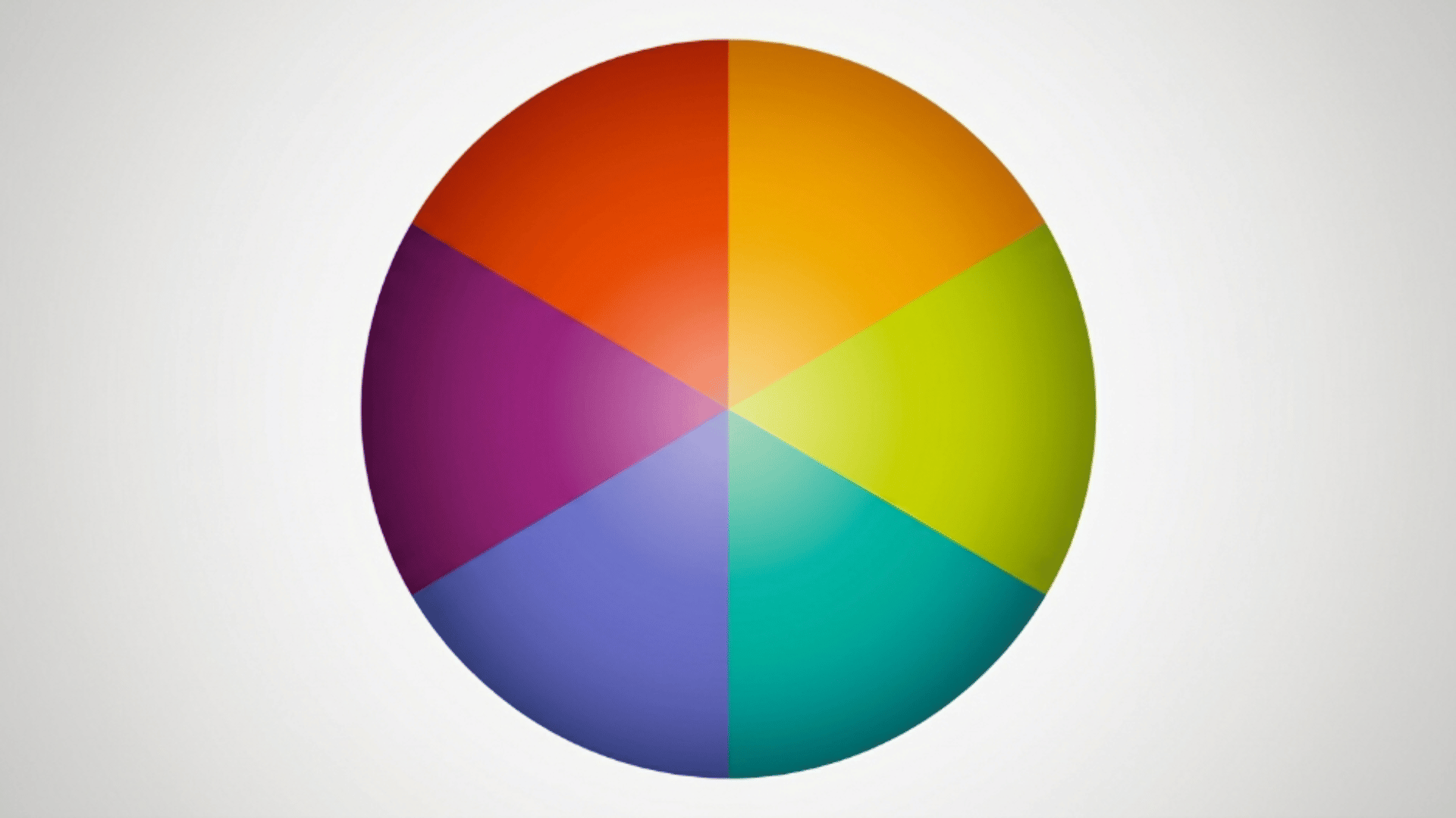
Using the Color Wheel
The color wheel is a simple visual tool that helps explain the color definition in art in a clear and practical way. It shows how different colors are connected and how they interact.
Artists often use the color wheel to understand relationships like complementary colors, which sit opposite each other, and analogous colors, which sit next to each other.
This makes it easier to create balanced and pleasing color combinations. The wheel also helps when mixing, as it shows how primary colors blend to form secondary and tertiary colors.
By using the color wheel, artists can apply the principles of color definition in art to avoid haphazard choices and create intentional compositions that feel visually easy to understand.
Basic Concepts of Color Theory in Art
It helps to start with the core building blocks before moving into ideas. These basic color groups form the foundation of art definition and guide how artists mix and use colors in their work.
1. Primary Colors
This primary color combination lays a strong foundation, blending warmth and coolness to create a palette that feels clear and visually well-structured without feeling overwhelming.
| Element | Role in Palette | Effect |
|---|---|---|
| Red | Base color | Adds warmth, energy, and strong emotion |
| Blue | Base color | Creates a calm and stable foundation |
| Yellow | Base color | Brings brightness and a sense of light |
| Overall Use | Balanced color base | Allows control over mood and visual impact |
2. Secondary Colors

This secondary color combination creates a smooth, balanced palette by blending mixed tones, resulting in a look that feels vibrant yet easy on the eyes, with no sharp contrast.
| Element | Role in Palette | Effect |
|---|---|---|
| Green | Mixed base color | Adds freshness and a natural, calming feel |
| Orange | Warm accent | Brings energy and warmth to the palette |
| Purple | Cool accent | Adds depth and a slightly rich tone |
| Overall Use | Balanced mixed tones | Creates a lively yet smooth visual effect |
3. Tertiary Colors
This tertiary color combination blends subtle variations of warm and cool tones, creating a palette that feels smooth, layered, and visually balanced, with no strong or sharp contrast.
| Element | Role in Palette | Effect |
|---|---|---|
| Red-Orange | Warm blend | Adds warmth and a soft, energetic feel |
| Yellow-Orange | Bright blend | Brings lightness and a gentle glow |
| Yellow-Green | Fresh blend | Creates a natural and calming effect |
| Blue-Green | Cool blend | Adds depth and a relaxed tone |
| Blue-Purple | Deep cool blend | Brings richness and a slightly moody feel |
| Red-Purple | Warm-cool blend | Adds balance with a soft, muted warmth |
| Overall Use | Balanced complex tones | Results in a refined and visually soft palette |
Use of Color in Different Art Forms
Each art form uses color in its own way to highlight details and strengthen the message. Color works across different forms to help build a deeper understanding of the color definition in art.
1. Painting
Color plays a major role in painting, from choosing a palette to blending shades.Artists use color to set the mood, create contrast, and guide the viewer’s focus.
It also helps show light, shadow, and depth on a flat surface. Through careful color choices, painters can express emotion and bring their ideas to life.
Different painting styles use color in unique ways, from bold strokes to soft blends. Color choices can also change how realistic or abstract a painting appears.
2. Sculpture
In sculpture, color adds another layer to three-dimensional work. It helps highlight texture, shape, and surface details.
Color also changes how light interacts with the form, making it look more engaging. This can add depth and make the piece more visually engaging from different angles.
Artists may use natural or applied color to improvise the material. Even subtle color changes can affect how the form is perceived.
3. Digital Art
Digital art uses color in flexible and creative ways. Artists use gradients, lighting effects, and layers to create depth and atmosphere.
Color can be adjusted easily, allowing for more experimentation. This makes digital artwork feel immersive and visually rich. Digital tools also allow precise control over brightness and contrast.
This helps artists create detailed and polished visuals.
4. Photography
Color in photography plays a key role in capturing mood and storytelling. Photographers use color to control tone, highlight subjects, and create contrast.
Natural light, filters, and editing tools all affect how colors appear. Strong color choices can turn a simple image into something powerful and memorable.
Color grading is often used to create a specific mood or style. Even small color adjustments can change how an image feels to the viewer.
Techniques for Applying Color Theory in Art
These methods make it easier to build depth, create mood, and improve the overall visual impact of an artwork.
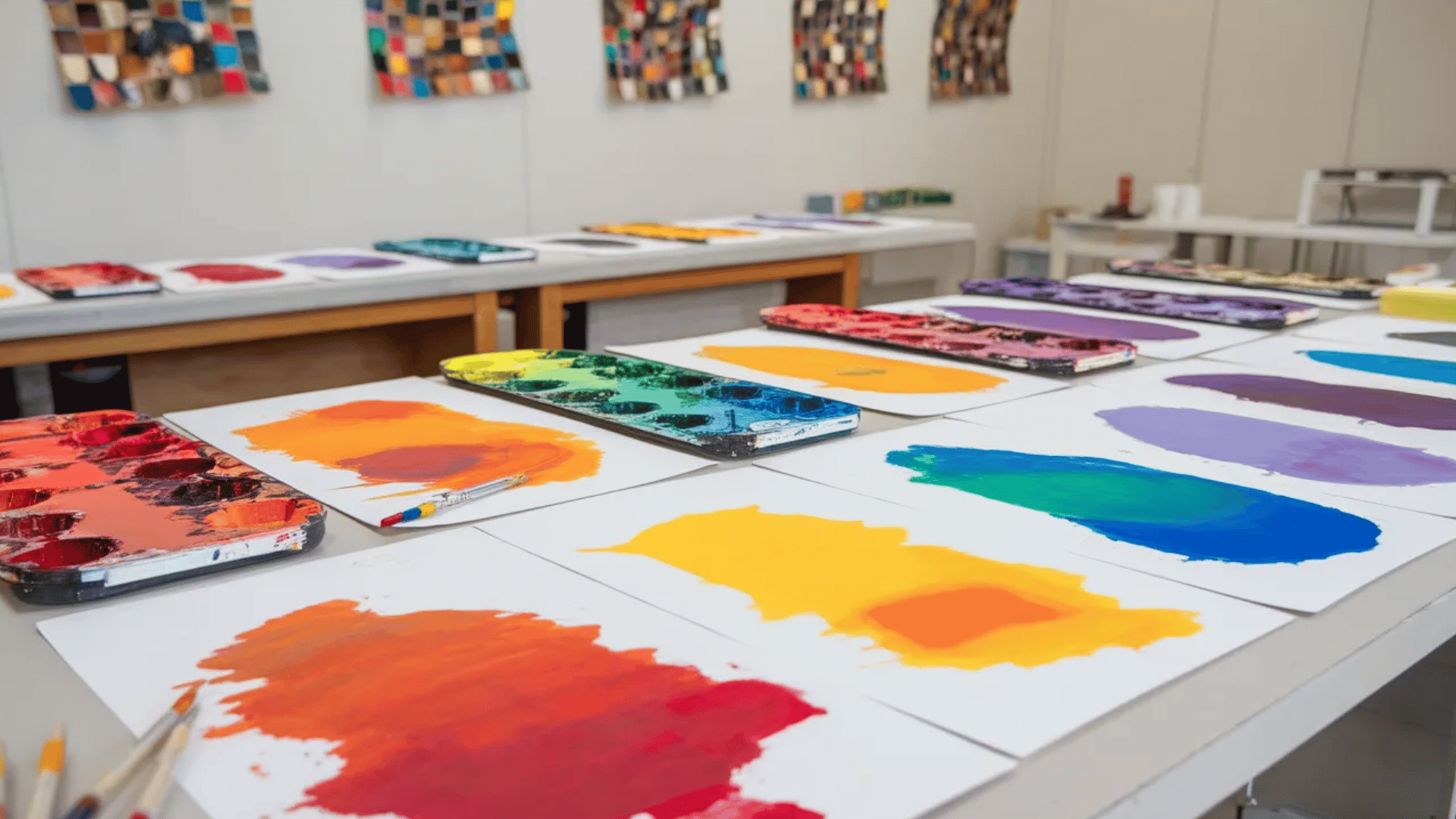
1. Color Mixing
Color mixing is the process of combining two or more colors to create new shades. It helps artists expand their palette beyond basic colors.
By adjusting the amount of each color, artists can control brightness, warmth, and tone. This technique is essential for creating realistic effects and smooth transitions.
2. Color Layering
Color layering involves applying multiple layers of color on top of each other. This helps build texture to the artwork. Each layer can change the final color, creating a richer look.
Artists often use this technique to achieve soft gradients and detailed finishes. Layering also helps create a sense of dimension and visual interest.
3. Color Contrast
Color contrast uses differences between colors to make certain areas stand out. Bright and dark colors or warm and cool tones are often paired for this effect.
Balance ensures that no part of the artwork feels too heavy or overwhelming. Together, contrast and balance help guide the viewer’s eye across the piece.
Symbolic Meaning and Interpretation of Colors in Art
Artists carefully select and apply colors to communicate emotions, ideas, and themes, making color integral to art’s power.
Psychological Effects of Colors on Viewers
Colors affect the human mind in various ways, and the color definition in art helps evoke different emotional responses while setting the tone of an artwork.
- Warm Colors: Red, Orange, and Yellow are often associated with energy, passion, and warmth. They can evoke feelings of excitement, urgency, or even aggression.
- Cool Colors: Blue, Green, Purple tend to convey calmness, sadness, or tranquility. They can create a soothing atmosphere or evoke feelings of melancholy.
- Neutral Colors: Browns and Grays have a grounding and calming effect, often used to create balance or provide a subtle backdrop that lets other colors stand out.
Cultural and Historical Significance
Throughout history, different cultures have attached specific meanings to colors, using them to symbolize important concepts and values.
- Red: Passion, love, and danger are conveyed through red, symbolizing intense emotions such as love, anger, and vitality, often evoking urgency and aggression.
- Blue: Calm, trust, and sadness are represented by this color, evoking feelings of tranquility, trust, and serenity, and often symbolizing peace and introspection.
- Yellow: Happiness, energy, and caution are symbolized by yellow, representing joy, positivity, and energy, often used to highlight or signal a warning.
- Black and White: Contrast, purity, and mystery are reflected in black and white, symbolizing balance, duality, and drama, often used to create focus and tension.
Interpretation of Colors in Historical Art Movements
Throughout history, art movements have used color to convey deeper messages, reflecting the social and emotional landscapes of their time.
- Impressionism: Impressionists used bright colors to depict fleeting light and atmosphere, emphasizing life’s transitory nature.
- Abstract Expressionism: In Abstract Expressionism, artists like Pollock and Rothko used intense color to express emotions and inner turmoil without representational forms.
- Fauvism: Fauvist artists, such as Henri Matisse, used wild, non-naturalistic colors to convey emotional responses, prioritizing color’s emotional impact over realistic representation.
- Pop Art: Pop artists used bright, vibrant colors to challenge traditional ideas of art, reflecting the energy and consumerism of modern society.
Conclusion
Color is much more than just a visual element in art; it is a language of its own that communicates emotions, messages, and cultural significance.
From the basics of color theory to its psychological and historical interpretations, the definition of color in art plays a vast and engaging role.
Artists use color not only to create visual harmony but also to evoke deep emotional responses from the viewer. Ready to experiment with color in your own artwork?
Start applying these color theory concepts to bring your creations to life and connect with your audience on a deeper level.
Frequently Asked Questions
Are there different types of color wheels?
Yes, artists use traditional (RYB), digital (RGB), and printing (CMY/CMYK) color wheels depending on the medium.
What is a split-complementary color scheme?
It uses one base color and two colors next to its opposite, offering contrast without being too harsh.
What is the color temperature shift in painting?
It refers to adjusting colors slightly warmer or cooler to create depth and realism.